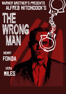
 Here's two comps I did for
an Alfred Hitchcock DVD
cover. Ultimately, I painted
another completely different
version that they used but I always enjoyed these. Obviously, the second one tells the story a little better but the first one has that nice grey coloring... Oh well. Wasn't too happy with the final version they landed up using but it was a fun assignment nevertheless!
Thursday, January 05, 2006
Subscribe to:
Post Comments (Atom)

12 comments:
those are sweet!!! i wish movie posters were still done like this.
great job!!
thanks Marco! Movie posters today aren't very artful and usually just consist of the star's headshot and some average typography. Nothing more. Most movie posters don't thrill me. You would think the big film company's would put more into it...
your totally right. There's this great book about black exploitation movie posters from the 60's and 70's that actually talks to the artist of the time. it's called "What it is, What it was!!"
This is just great illustration work.
wow
always thought this was one of the best things you have done.
Thanks Bill!
great "saul-bass-touch"!!
wow... that's really nice to hear. His work is very inspiring and his style with type is always a treat. Thanks Rubio!
Hey Dan,
Any chance you might be able to show a step by step on how you created this image? I'm sure I mentioned this the first time I saw it, but I think it's one of your best pieces. I love watching your work develop and grow!
Best,
Rich
I do have some black and white scans and some "work in progress". I'll post them next if you'd like.
Thanks Rich!
Cool, Dan, that would be great! I'd love to see the black and white. I'm curious about what methods and tools you used to create the image.
I like the other Wrong Man too (I think the green one works better, of the two), but I always thought this one was the stronger piece.
Best,
Rich
Post a Comment