
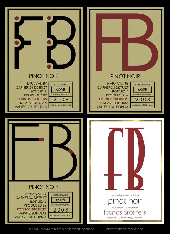
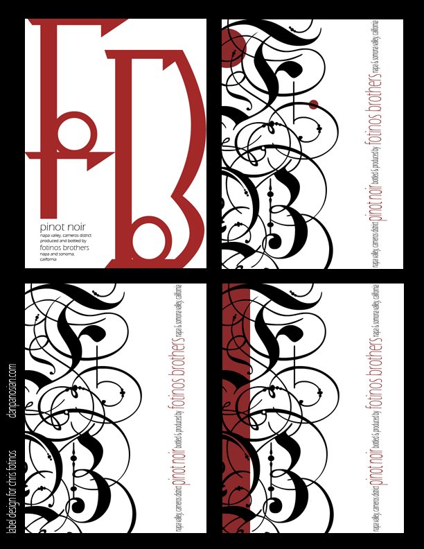
Ah, aged crushed grapes. I've designed some wine labels. A nice departure from my usual work.
My Father was a terrific designer and did a bit of cartooning [ similar to Jim Flora in style ] and if he was still around today I think he would of seen a nice renaissance of that late 60's early 70's design style he was so good at. Too bad he passed away, he'd be swimming in work!
Like most ad guys, he started out as a sign painter before going to art school. I remember going through Font and Typeface trade magazines with him as a kid. Oddly, I was fascinated by it. I'm always excited to design a logo...!
Monday, March 27, 2006
Last Call!
Subscribe to:
Post Comments (Atom)
19 comments:
Wow, what a great blog! Love your character and BG designs. Will be back for more:)
Take care,
Hans
Nice logos here Dan... I am a junkie for logo design myself. It is interesting how the clients always seem to choose the ones we think are a bit tame isn't it? You did a great job with these!
These are so awesome always loved that stylish designing of letter and templates so sweet, thanks for the droppin in and the oh so kind words i just strive 4 perfection but it's a hard road well hope you've chill keep rockin it bro !!!
As you know Dan I love these. You have a great sense of design for this kind of thing. More.
I'm with Bill, please show us more of this!
Great.
Hi Dan, the color of monster illo was done completely in PS.
Once I've rendered all the color stuff to get that texture I used a simple fliter.
Duplicate the color layer and choose the same predominant color (blue in this case) and black or some kind of darker blue.
And then Filter –> Sketch –> Halftone Pattern. Then, turn this layer to multiply and put the opacity to 50% or less and that's all. Add some noise and texture is done!
The line was done with a caligraphc pen (in the real world).
thanks Bill! Glad to hear you like them! I really enjoy design work as much as illustrating. I eventually have to take a class and learn Illustrator to some degree.
Hey R2D,
That's an interesting process and the results were definately worth it. Illustration Friday seems like a fun time!
Love these set of design!! Simple and elegant, it's amazing to see varieties of beautiful designs from two letters!! '
BTW, I up-date the "monster" illo in the store. :)
Cheers.
cool! Thanks Alina! I picked up the notebook! Much appreciated!
All labels are nice, but my favourite is " gold border", simply and perfect for a bottle of wine.
thanks for your comment.
About colours, I use levels and brush on photoshop cs.
I feel that the top left one is the most appealing for me. Part of me thinks it's for some weird box of electronics from long ago, and I suppose that is what initially draws me in, and then I see what it is for, and I want it. I suppose this is different if you see that it's on a bottle first, but regardless I like that one the best.
I always find it interesting to see design by artists whom I have only seen "non-design" stuff by.
I like these. The bottom set especially.
The question is, though, how is the wine?
How's the wine? Apparently it ranks very, very highly. Who knew? I think bottles will be going for $75+ or so.
Thanks Mike. If you click on any of the images on this blog the illustrations will magically enlarge [ only Photobucket posts! ].
I think you're used to Jeff's blog. I don't see the point of using photobucket for art blogs. There's a feature built into the blog browser [ the landscape icon ] so you can easily insert JPEGS. Photobucket works best for things like MySpace. Usually that stuff is just a cute photo or maybe a animated GIF or mini player.
Man, you do it all!!! I don't think that i would have the patience or eye for this type of work, so I really appreceiate it!
I have just as much fun doing this sort of thing as I do drawing. I love logos and design work. Judging from your work I think this sort of thing would come very naturally to you. Your eye for detail and your aesthetic makes me wonder why I draw at all!
hi there,
real neat graphic sensibility you have. your other illustrative work is good too. carry on the great work.
chandan crasta
Post a Comment