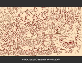
 Haven't had enough of Harry Potter over the past few years? Good news! Click on the above illustration and soak in all the magical goodness. I did this a few years ago for Warner Bros and always liked how it came together. Maybe you do too... I can't determine exactly how it will make you feel. Perhaps you'll be filled with an unquenchable rage, in which case - I accept full responsibility. But let's say on the off chance that you do like it... Well, that's good in my opinion. I've managed to affect your emotions. I mark that as a positive.
If, however, you feel absolutely nothing after hours of inspecting the aforementioned work then I must also accept that. Accepting it does equal failure to some degreee but please don't let that bother you.
Tuesday, February 28, 2006
More Harry Potter [ just for you ]!
Subscribe to:
Post Comments (Atom)

13 comments:
Hey, Dan. it's incredible how these last two posts remind me of Bryan Talbot's art..do you know the guy?
anyway, great job!
Thanks Andrea. He was working on Swamp Thing when I first started doing work for DC Comics. I haven't seen a whole lot of his recent work but I recall a Leonardo Da Vinci comic he did for DC a few years back...
In terms of this illustration I was probably going for a Michael Kaluta feel. I'm sure Bryan was looking at Kaluta during his Swamp Thing stint and maybe there's a bit of a cross-influence there.
Hah! I remember the scene!
I see you are the Wizard yourself!
Great picture.
AWESOME!! This is too coool!!
I suppose when I don my glasses there is a similarity between me that Potter fellow! My magic wand is the Wacom Pen!
Hey bro love your linear work it's so fresh thanks for the kind words and yeah that kat daddy long legs is suppose to be a scary mother more to come soon from back then hope your kool like the breeze take it easy seen!!!
Great work as always! Hey, I used to have an original art page that was pencilled by Arther Adams and was a back up story for Gen 13 of Fairchild at a state fair or circus. It had GREAT inks and I think it was by you or Art Thibert. Sound familiar? (Oh, I sold it awhile back to finance my own comic self-publishing)
***you rock my world!!!** inspirational and bookmarked! Thanks for such loveliness!
Hey Tom -
Arty and I never worked on Gen 13. but I know the Art Adams work you're talking about. It's hard to tell the difference on some that inking from that time period. Scott Williams, then Art Thibert and lastly - little ol' me inked work based on theories created by Jim Lee and Whilce Portacio. I believe they sort of homaginized their influence from a Gil Kane and Klaus Janson job...! Anyway - the look took off and consumed the landscape of most of the popular finished art from the 90's. It's taken me a decade to sort of regroup my whole artistic direction.
Hey TBitch, I have the original somewhere but I probably won't sell it. I will make you a nice print though if you'd like!
This is very interesting and fun to look at. It's a little terrifying catching a spider in the corner of my eye that I hadn't noticed at first!
Forgive my ignorance, but what are these ultimately used for?
Before the movie was made [ and this is for the second one I believe ], sets hadn't been completed but production art had to be drawn up. This design was later digitally painted and used again for merchandizing.
Oh, awesome!
thats amazing mate
Post a Comment