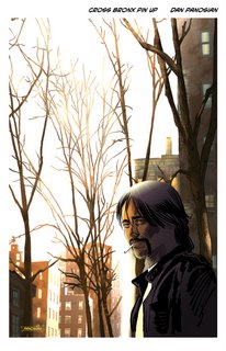

My amigo, Ivan Brandon, asked me to illustrate a pin up for his new hit Image book, Cross Bronx! One of the characters bears a strange resemblance to ol' Ivan himself! Hmmmm... My drawing isn't exactly Ivan, per se, but he's got that little smirk Michael Avon Oeming gives him. It's a pretty hip comic book! You should definitely check it out!
With this pin-up I really wanted to capture that New York feel. Guys like Jamie Hewlett have a knack for creating believable environments for their ultra cool cartoony characters. That's sort of the angle I was going for here.
A very fun experiment and my favorite part, you ask? No RULERS were harmed or used in this drawing!
Wednesday, September 20, 2006
Cross Bronx
Subscribe to:
Post Comments (Atom)

21 comments:
Nice urban ilustration for a early moorning here in Barcelona.
nice! i'm really loving the painterly looseness you've got going on in the background. very nice stuff, Dan!
I am digging the subtle color.
Nicely done. Great atmosphere too.
nice.
I like the sense of light.
mid morning or late late afternoon
looks good
-brian
It pains me to admit that I like this. I would like to see a wee bit of texture on the top of the hair, though. It's a kind of dome-looking.
RURALBARBARIAN: Good point. I'll fix it up and re-post it.
Ah... Much better! Thanks!
Is niiiiice!!! Now just remove that distracting PANOSIAN box.
great! Ivan and Mike should be very proud!
RAPP: Wha...?!?!? You're up to something, I just know it!
Looks really good, sir. I dig what you did to the background. I would go so far as to say that you don't need the person in there, if he wasn't the main subject of the pin-up, if you know what I mean.
Death to rulers! Who needs 'em? Human lines are better.
JEFF: My wife said the same thing! And I've learned that she's always right! And, yes - human lines are always better!
yeah, that background is great, love the shapes, the texture and of course the bloom. Show us more urban landscapes!
Nice style!
Congrats on the pin-up gig, the lighting is amazing. I did those buildings in the back!
awesome, I love the lighting too!! beautiful!
GERMAN: I love urban landscapes, but no one loves them more than Bill Wray! Check out his blog: http://williamwray.blogspot.com/
BOBBY: Thanks! Just saw some of your work featured in that great PS Painting magazine from the UK! Way to go!
GERALD: Thanks!
ALINA: I'm trying!! Thank you!
Killa mood!!!
I love the light effect trough the trees, a really inspired atmosphere for an awesome pin-up ;)
wonderful urban ink.
Love the design of detail vs empty areas.
Post a Comment